
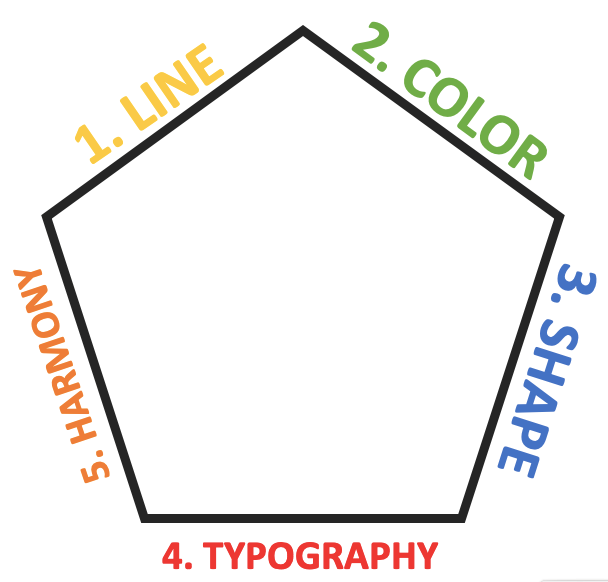
5 Basic elements of design:
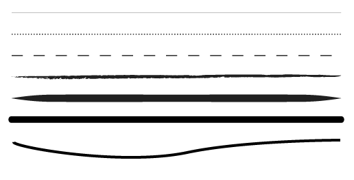
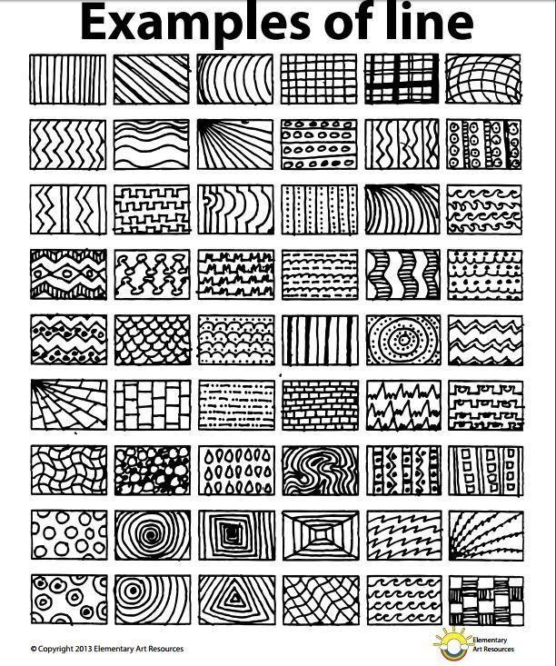
1. Line
The first and most basic element of design is that of the line.
Lines are useful for dividing space and drawing the eye to a specific location. For example, think about how a magazine uses lines to separate content, headlines and side panels.
https://sites.google.com/a/brightoncps.wa.edu.au/year-5-2016/art/lesson-one-element-of-line
https://sites.google.com/a/brightoncps.wa.edu.au/year-5-2016/art/lesson-one-element-of-line

More onthe Basics of Lines and How to Use Them in Design
https://www.designmantic.com/how-to/how-to-use-lines-to-create-an-impact-in-graphic-design
https://www.lifewire.com/lines-in-typography-1078106
2. Color
Color is one of the most obvious elements of design, for both the user and the designer. It can stand alone, as a background, or be applied to other elements, like lines, shapes, textures or typography. Color creates a mood within the piece and tells a story about the brand. Every color says something different, and combinations can alter that impression further.
Here is one way to look at it:

https://visual.ly/community/infographic/business/color-emotion-guide
Try one of these free apps to find your ideal color palette
paletton.com
coolors.co
Free High -Quality Stock Photos:
Research on color:
In an appropriately titled study called Impact of Color in Marketing, researchers found that up to 90% of snap judgments made about products can be based on color alone (depending on the product).
And in regards to the role that color plays in branding, results from studies such as The Interactive Effects of Colors show that the relationship between brands and color hinges on the perceived appropriateness of the color being used for the particular brand (in other words, does the color “fit” what is being sold).
The study Exciting Red and Competent Blue also confirms that purchasing intent is greatly affected by colors due to the impact they have on how a brand is perceived. This means that colors influence how consumers view the “personality” of the brand in question (after all, who would want to buy a Harley Davidson motorcycle if they didn’t get the feeling that Harleys were rugged and cool?).
The study Exciting Red and Competent Blue also confirms that purchasing intent is greatly affected by colors due to the impact they have on how a brand is perceived. This means that colors influence how consumers view the “personality” of the brand in question (after all, who would want to buy a Harley Davidson motorcycle if they didn’t get the feeling that Harleys were rugged and cool?).
Additional studies have revealed that our brains prefer recognizable brands, which makes color incredibly important when creating a brand identity. It has even been suggested in Color Research & Application that it is of paramount importance for new brands to specifically target logo colors that ensure differentiation from entrenched competitors (if the competition all uses blue, you’ll stand out by using purple).
As all of this is clearly valid and many times confirmed for profit driven businesses it is equally applicable for NGOs. After all it boils down to the fact that color can facilitate the achievement of any communication objective because it links and translates values into graphic elements and values are universal across types of organizations regardless of the business model they are using. The point is that as humans we spontaneously react to the color content around us and the fact that you are an NGO doesn’t stop this mechanism J
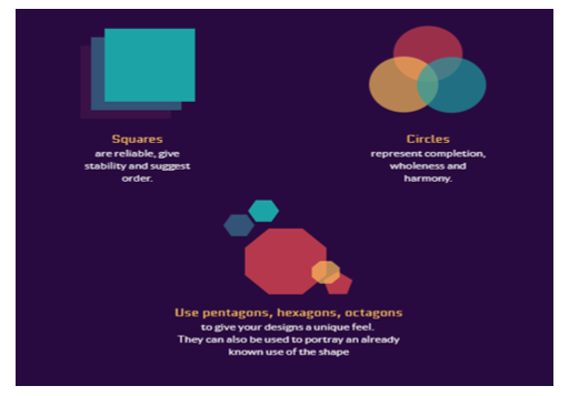
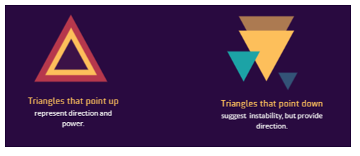
3. Shape
Shapes, geometric or organic, add interest. Shapes are defined by boundaries, such as a lines or color, and they are often used to emphasize a portion of the page. Everything is ultimately a shape, so you must always think in terms of how the various elements of your design are creating shapes, and how those shapes are interacting.
https://visme.co/blog/geometric-meanings/
https://visme.co/blog/geometric-meanings/
5 ways to use shapes creatively in your designs
https://www.canva.com/learn/use-shapes-creatively-design/
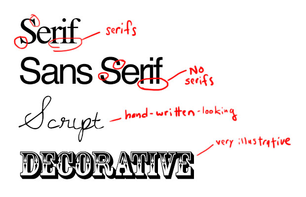
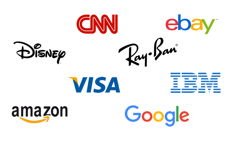
4. Typography
Perhaps the single most important part of graphic and web design is typography. Like color, texture, and shapes, the fonts you use tell readers you’re a serious online news magazine, a playful food blog or a vintage tea tins shop. Words are important, but the style of the words is equally essential.
Some basic types of fonts:
https://icons8.com/articles/typography-logo-design/
Different use of fonts in logos:
https://icons8.com/articles/typography-logo-design/
Further reading:
https://icons8.com/articles/typography-logo-design/
Free fonts
With all these fonts, make sure you are using ones that are free to use for commercial projects.
5. Harmony
Harmony is the ultimate goal of graphic design. Harmony is what you get when all the pieces work together. Like a house of card (pretty sure you’ve seen the TV show at least… ;)) if 4 elements are aligned and the last one is of balance it can take down the whole structure and you can end up with a design that is not harmonious. Great colors with bad font will suck as much as a great shape with wrong lines. Nothing should be there if it doesn’t belong there. Great design is just enough and never too much.
TRUNK – VISUAL IDENTITY DESIGN (continued)
Elements of design form elements of brand identity from basic to more complex ones.
Simply put, brand identity is all design that can be seen coming from one organization or project.
BRAND IDENTITY:
-
Logo
-
Colors
-
Typography
-
Design System
-
Photography
-
Illustration
-
Iconography
-
Video and motion
-
Web design…
Good design and good brand identity elements are:
-
Distinct: They stands out among competitors and catch your audience’s attention.
-
Memorable: They make a visual impact. (Consider Apple: The logo is so memorable they only include the logo—not their name—on their products.)
-
Scalable and flexible: They can grow and evolve with the organization or project.
-
Cohesive and complementary: Each piece complements the brand identity.
-
Easy to apply: It’s intuitive and clear for designers to use.